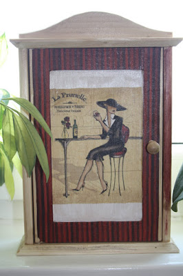
I named it "La Prunella" - it's how the caption on the picture top left corner reads, perhaps giving a name of a restaurant or a brand of wine. But in Polish and in English alike it sounds like an old-fashioned first name a lady a bit misplaced in time and space, but how lovely on the other hand. The person for whom the cabinet was intended likes retro style, hence the choice.
The beginnings:
And the final version:
Technique: front door - decoupage (paper napkin collage) + acrylic paint for shadows and gilding; the rest - acrylic paint (van Gogh); transparent varnish: matte (front door) and gloss (the rest) finish.
Wednesday, 20 April 2011
Monday, 18 April 2011
decoupage: key cabinet #3
This key cabinet was eventually meant to be a present for a person collecting antiquities and vintage items. I called it "France-Provance", but don't ask me why!

Technique: paper napkin decoupage + acrylic paint. Acrylic paint was also laid layer by layer on the whole cabinet.
Sunday, 17 April 2011
decoupage: key cabinet #1
There is something intriguing about the idea of a "key cabinet". It's a miniature cupboard which is decorative in itself, on the one hand, and on the other - it solves the perennial problem of "who has seen the cellar key?" or "where on earth is the workshop key, it was supposed to be in the top left drawer!".
The first key cabinet I made was for our place. I called it "A'la Gitarra". It shows a fragment from Myles Sullivan's work. I was amazed at the whiteness of the guitarist's shirt, and that music is almost audible when you look.
The technique: paper napkin decoupage + acrylic paint for the front picture. The rest of the cabinet - transparent wood varnish.
Saturday, 16 April 2011
soft pastels: tea for two
This is a wedding anniversary postcard I drew about two years ago for our friends:
Of course, I should mention the photograph by Patricia McAdie, whose photograph was the model for my drawing. I quite envy her the opportunity of actually witnessing this meeting at the teacup feeder!
Of course, I should mention the photograph by Patricia McAdie, whose photograph was the model for my drawing. I quite envy her the opportunity of actually witnessing this meeting at the teacup feeder!
Wednesday, 13 April 2011
drawing: soft pastels
I rely on intuition in endeavours like those. I love putting on the layers of colour, one after another, which with soft pastels is virtually an unlimitted option.
The initial sketch and workshop (starting in the evening, hence the coffee:)
It took a bit more than I extepcted, but was fun. The last element, the gas lantern, almost ruined the whole drawing. I still think it might be a bit tilted. On the other hand, it adds up some atmosphere - at least that's what I was hoping for!
The drawing was intended as a gift - a souvenir from Wrocław to our special friend - and is now hanging on the wall - to my joy - in a flat in Chennai, India.
Subscribe to:
Comments (Atom)


